Thursday, 8 October 2015

08/10/15 - Visual Research Drawings

For research week, I focused on objects that required minimal colour and shapes. These are the everyday objects that I came across; that I think linked well with my intention of minimal colour use.

reflection of bus stop window
Vase details


One of my henna designs
Rock path in Piccadilly Gardens
After a weeks worth of research, I felt as though I hit a wall on what else I could look at. During today's tutorial, we were shown these samples created by the previous year and what they had created. I am really inspired by these specific drawing technique as it is something unusual and something that I myself am into.

bleach used on the outside of the circle.
bleach used on the inside of the circle.


A collection of circles being used in different techniques to make the ink bleed. 
My primary images and interpreted drawings of them


This image was inspired by the work done by the previous year. It was fascinating to see how watercolours and acrylic react. This is something that I could see developing in this unit.


Out of all my drawings so far, this is my favourite. the techniques used here was mainly blending charcoal with water colour and then applying gold paint through a henna tube. Applying the gold colour using the henna technique; I found it really useful as I have control over it from doing actual henna on different areas of the body.

Monday, 21 September 2015

Summer Project Feedback

So, this summer I recorded my summer through a range of drawings. Materials that I used were watercolours, fine lines, pens and gouache. I felt the best way to record my summer was by drawing what was close to me i.e. family and my cats! So therefore essential objects such as my cat’s paw print and my mother luggage to go abroad with, will pop up randomly. 
Fig 1

Fig 2
 

 Fig 3
 
Fig 1 and 2 were the first drawings that I had done in the holidays as I felt the need to go back to my own personal hobby of applying henna and drawing out more designs. I came across Aztec design and incorporated them into my own designs. These two patterns have very similarity in both simplicity and elegance yet neutral colours. Something I would like to be carrying out onto my units. I was able to fuse both of these drawings into one and in Fig 3, you can see that this was done successfully.

Fig 4
Some of my drawings did not turn out the way I planned. For example fig 4 was one of those particularly paintings that was not willing to dry. However, from my peer group’s feedback, they specifically liked that one. They had also mentioned that as my specialism is embroidery, I could layer up materials and work into the pieces individually. I thought about how I could cooperate colour like this onto material mentioning to my group that print is not one of my strengths. What I did not think about is how I could apply colour directly onto the material and work over it.

Fig 5
Fig 5 is one my favourite ‘mistake’ drawings that I had created. What was fascinating to find out was that the marks that was left on the black paint, my peers had thought I had used something on top of it to give it such an effect; when all I did was close the page once and left it to dry.


Fig 6
 
Fig 6. A drawing I had control over and I felt that the colours used was just right. The piece is a replica of my Quran. The technique I had used to create the intricate gold design was the same as I apply henna; through a cone.

Fig 7
 
Fig 8

Fig 7 and 8 was created from inspiration from the artist Stina Persson. Persson often uses colour in her work so I had a go doing this myself. I found myself to work better with fusing colours rather that painting the outline of the object. From the feedback I feel like I have an idea of where to start off and possibly develop on.


Saturday, 19 September 2015

Artists for Inspiration

First Artist: Dina Torkia
Fig 1
Fig 2
Torkia is a Muslim designer and blogger. Her work has come an interest to me because of the use of colours for her hijabs (scarves). In her YouTube videos she mentions her purposes for using the colours, materials and sizes. As a Muslim myself I feel that I can relate to her because I wear hijab myself and as an art student, it is unusual for me to wear natural colours all the time, or same style. From this artist, I feel that I can use her technique of dying materials when it comes to selecting materials.


Second Artist: Stina Persson
Fig 1
Fig 2
Fig 3
Most of my colour pallets have been blacks, greys and whites. So for colour to inspire me more I have chosen this artist, Persson. I am familiar with her work as I worked with it before. A specific reason to why her work interests me is because, as I was looking through my first drawing days, I came across Fig 3 and realised how similar our work is. Fig 3 was created from ink and bleach.


Third Artist: Susie Macmurray

Fig 1
Fig 2
Fig 3
Macmurray is an installation artists that works repetition and unusual objects to create her pieces. one piece of work of hers that interested me was the one with shells filled with red velvet materials Fig 2. Macmurray held a lecture and explained that in order to create that piece, it took months of cleaning out the shells and looking for identical shells. this is obviously something you would need patience for. I have experienced a snippet of this from college from my 'depression' project that I worked on, which required me to make several masks as you see the final piece in Fig 3.

From researching artists that I can relate to and who interest me, huge installations has come across as a major interest for me. In the past I have adapted my work to being on a smaller scale with less detail. But from the experiences at uni and looking at other artists (singer, fashion designers, painters etc.) I feel that the best scale for me to work with is big like Macmurray in Fig 1.


Henna

Fig 1
Fig 2
Fig 3
Fig 4
Throughout my Summer in 2015, I went back to my interests of henna designs. After the first year of university, I felt more advanced in designing with different objects, materials and techniques. So I incorporated these skills into my henna designs.


Fig 1 is where I first began my designs (on paper). I then moved onto applying henna on my own body as you can see on Fig 2. I then thought about how I could apply the Fig 1 design with henna onto myself without leaving strong stained smudges; as henna tends to leave stains within seconds. this skill required an awful lot of patience, practice and accuracy. The outcome of how I did that is seen on Fig 3. As I mentioned before when planning to do big installation pieces, like Fig 4 I would love to have the ability to do my henna designs on larger areas on the body.

Friday, 18 September 2015

MY2015SUMMER


CLICK THE  LINK BELOW TO VIEW MY2015SUMMER

https://youtu.be/rOT3ORO4Vxg

I know that this was not requested for the summer project but I felt that when it comes to showcasing something that I have done, I work best with photography. It probably doesn't relate to my profession in anyway but this is something that I enjoy doing. So enjoy!

Friday, 8 May 2015

Sixth Week of Unit X

This week I finally decided what I wanted my finally piece to look like, what format, and what placement should be included on it. As a result, for the final piece I had to quickly plan what I was going to do the next 3 days in order to finish the piece.


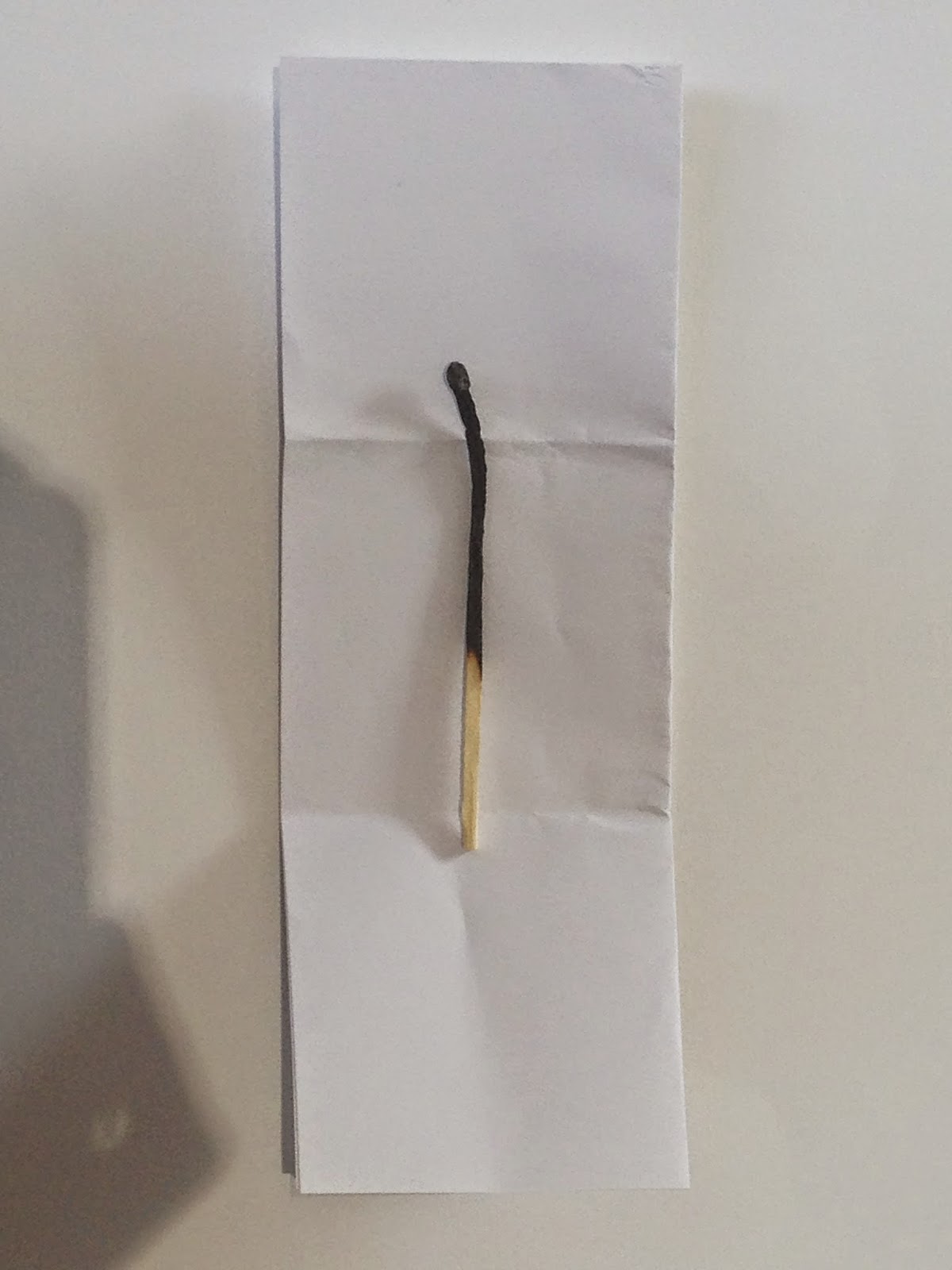
The decision for choosing to work with a rectangle piece was from looking at my Friday drawind session where I was challenged to draw a matchstick on a large scale.

I began hand stitching some areas but realised that it would be impossible to do the whole thing by hand within this weeks without me messing up. Therefore, I did some fingerprints by hand and some by the help of the domestic machines.
Hand stitching
With the help of the domestic machine, I was able to work faster and new ideas and techniques developed along the way. An example is that when I was rushing to complete my piece, a lot of thread began gathering when I would forget to chop them off. From this I left it as it was; it linked in with how the base of my material was and also the edges.
Domestic Machine


During this week, there was a tutorial.in this tutorial while I was explain my intention for my final piece. After talking about it, my tutor mentioned that I have been jumping around in this unit a lot and that my work does not seem to be linking clearly due to that. I understood that but now it was too late to make changes.

Friday Drawing Day


Today’s session was extremely helpful. I was able to understand how my final piece would be visually effective. Instead of hanging it as a long piece, I could present it on plinths or boxes. My tutor also mentioned my large scale drawing and how I could co-operate that drawing within my final piece. I’m feeling unsure about this idea because it doesn’t seem like a good link in my head but we’ll have to see by experimenting on the day of setting up at the Federation House for the show!

The back of the piece seemed appealing so I thought about how I could showcase the back and front of my final piece.

Sunday, 3 May 2015

Fifth Week of Unit X

Peer Group Presentation


This presentation was yet again about talking through about my work so far. When I was questioned about what form my final pieces would take on, on the spot I said wedding veil. I think this was because of the wedding dresses that was displayed and I instantly though about how I’ve been using white light weight material. After the presentation I dint feel sure about whether I should do a rectangle  wedding veil because materials used for veils are very light and simple. From the Easter break, I was sure to take on the finger prints idea forward. So from this mixture of wedding veil and finger/ hand print didn’t really sound good. I have drawn designs but they do not seem like something you would see on a gown, perhaps a wall hanging.  

Google Images
So I went out and did more research on what materials I would need to print my hand print that would come out clearly and also something that wasn’t to stiff.  


Reflecting back on my sketchbook and where I am at the moment, I realised that my references weren’t really being acknowledged much. 


Friday Drawing


This Friday drawing I think was not at all beneficial for me because all we did was cover white paper with a black oil bar and cover a black piece of paper with a white oil bar. I ended up with three drawing of the same objects which I think was a wasteful time as I could have done this in my own time and instead of doing this under staff surveillance, I could have made my time more efficient by spending it on final piece/pieces.

Fourth Week of Unit X

This week I have been continuing with printing my own hand/ finger print of paper, material etc.


Friday Drawing Day - Matchstick


This drawing session was all about large scale drawing. I feel that this day was really helpful in making me thinking about what size I should be working at is my final piece is going to be a rectangle piece of 1 metre and 80 cm or a square piece which consists of 1 metre by 1 metre.


Sizes of the rectangle and square pieces that my final piece could be on.