So, this summer I recorded my summer through a range of
drawings. Materials that I used were watercolours, fine lines, pens and gouache.
I felt the best way to record my summer was by drawing what was close to me i.e.
family and my cats! So therefore essential objects such as my cat’s paw print
and my mother luggage to go abroad with, will pop up randomly.
 |
| Fig 1 |
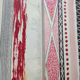 |
Fig 2
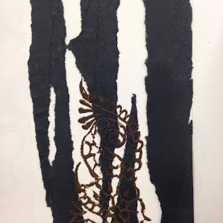
Fig 3
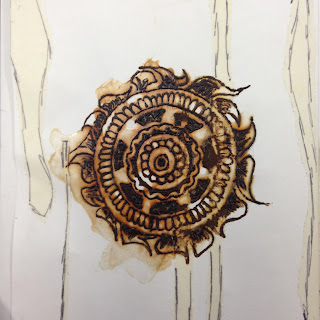
Fig 1 and 2 were the first drawings that I had done in the
holidays as I felt the need to go back to my own personal hobby of applying
henna and drawing out more designs. I came across Aztec design and incorporated
them into my own designs. These two patterns have very similarity in both simplicity
and elegance yet neutral colours. Something I would like to be carrying out
onto my units. I was able to fuse both of these drawings into one and in Fig 3, you can see that this was done successfully.
|
 |
| Fig 4 |
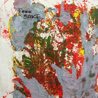
Some of my drawings did not turn out the way I planned. For example
fig 4 was one of those particularly paintings that was not willing to dry. However,
from my peer group’s feedback, they specifically liked that one. They had also
mentioned that as my specialism is embroidery, I could layer up materials and
work into the pieces individually. I thought about how I could cooperate colour
like this onto material mentioning to my group that print is not one of my
strengths. What I did not think about is how I could apply colour directly onto
the material and work over it.
 |
| Fig 5 |
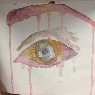
Fig 5 is one my favourite ‘mistake’ drawings that I had
created. What was fascinating to find out was that the marks that was left on
the black paint, my peers had thought I had used something on top of it to give
it such an effect; when all I did was close the page once and left it to dry.
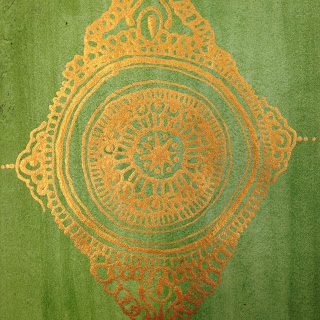 |
Fig 6
Fig 6. A drawing I had control over and I felt that the
colours used was just right. The piece is a replica of my Quran. The technique I
had used to create the intricate gold design was the same as I apply henna;
through a cone.
|
 |
| Fig 7 |
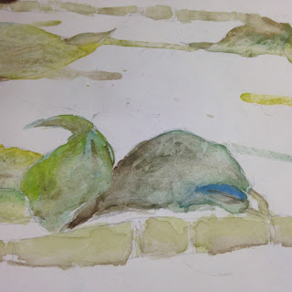 |
Fig 8
Fig 7 and 8 was created from inspiration from the artist Stina Persson.
Persson often uses colour in her work so I had a go doing this myself. I found
myself to work better with fusing colours rather that painting the outline of
the object. From the feedback I feel like I have an idea of where to start off and possibly develop on.
|